How to Create a Style Guide for Your Small Business Website
You launch your website, and everything looks great. The colors match, the fonts are consistent, the buttons all look the same. Fast forward six months. You have added a dozen blog posts, updated your services page three times, and hired a freelancer to build a landing page. Suddenly, your H2 headings are three different sizes across different pages. Your call-to-action buttons are blue on some pages and green on others. Your blog posts alternate between formal and casual tone with no apparent pattern. The site that once felt cohesive now feels like it was assembled by five different people who never spoke to each other. This is the problem a style guide solves, and it is far easier to create one than to fix the mess that accumulates without one.
What a Website Style Guide Is (and Is Not)
A website style guide is a reference document that defines the visual and verbal standards for your site. It specifies exactly which colors to use, how headings should be styled, what buttons look like, how images should be formatted, and what voice your written content should follow. Anyone who works on your site, whether that is you, a team member, a freelancer, or an agency, can reference this document to make decisions that stay consistent with the overall design.
A style guide is not a brand strategy document. It does not explain your target audience, market positioning, or business goals. Those are important, but they belong in a separate document. A style guide is purely practical. It answers the question, "When I need to add something to this website, what should it look like and sound like?"
It saves time. Instead of making design decisions from scratch every time you add a page or post, you reference your guide and the answers are already there.
It prevents drift. Without documented standards, small inconsistencies creep in over time until your site feels fragmented.
It empowers others. When you hand off work to a freelancer or employee, a style guide gives them clear guardrails that protect your site's quality.
It speeds up decisions. "Should this button be blue or orange?" is no longer a debate. The style guide has the answer.
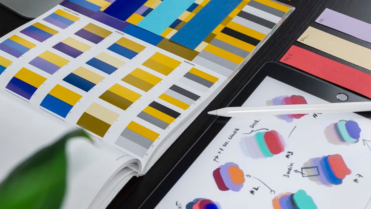
Section 1: Color Definitions
Your color section is one of the most referenced parts of the style guide. It should document every color used on your website with precise values and clear usage rules.
What to Document
Primary brand color. Include the hex code, RGB values, and a visual swatch. Describe where this color is used (logo, primary buttons, key headings, etc.).
Secondary colors. Same documentation as primary, plus clarification on when secondary colors are used instead of the primary.
Accent color. Document specifically which elements use the accent color. Typically, this is reserved for primary CTAs, important links, and alert states.
Neutral palette. Document your specific shades of white, gray, and black. Include background colors, text colors, border colors, and divider colors. Be precise here, because "gray" can mean a hundred different things.
Functional colors. Define colors for success states (usually green), error states (usually red), warning states (usually yellow/amber), and informational states (usually blue). These are important for forms, alerts, and notifications.
Example Color Documentation
Here is how a single color entry might look in your style guide:
Primary Blue: #2563EB. Use for primary buttons, active navigation states, and text links. Do not use for large background areas. Accessible on white backgrounds (contrast ratio 4.56:1 for text). For hover states, use #1D4ED8 (10% darker).
This level of specificity eliminates guesswork. When someone needs to style a button, they know exactly which shade of blue to use, which shade for the hover state, and where this color is (and is not) appropriate.
Section 2: Typography Standards
Typography consistency is where most websites fall apart first. Without clear rules, heading sizes drift, line heights vary, and font weights get used inconsistently.
What to Document
Font families. List your heading font, body font, and any accent or monospace font. Include the source (Google Fonts, Adobe Fonts, self-hosted) and the specific weights loaded.
Type scale. Define exact sizes for every heading level and body text. For each size, specify the font family, weight, line height, letter spacing (if applicable), and color.
Here is an example type scale documentation:
H1: Plus Jakarta Sans, 700 weight, 40px/48px (font size/line height), color #1a1a2e. Used for page titles only. One per page.
H2: Plus Jakarta Sans, 600 weight, 32px/40px, color #1a1a2e. Used for major section headings within a page.
H3: Plus Jakarta Sans, 600 weight, 24px/32px, color #1a1a2e. Used for subsection headings within H2 sections.
Body: DM Sans, 400 weight, 18px/28px, color #374151. Used for all paragraph text.
Body bold: DM Sans, 700 weight, 18px/28px, color #374151. Used for emphasis within body text.
Small text: DM Sans, 400 weight, 14px/20px, color #6B7280. Used for captions, metadata, and footnotes.
Paragraph spacing. Define the spacing between paragraphs, between headings and following text, and between sections.
List styling. Specify bullet style, indentation, and spacing for ordered and unordered lists.
Link styling. Define how text links appear (color, underline, hover state, visited state).
Section 3: Button and CTA Styles
Buttons are the action drivers on your website. Inconsistent button styling confuses visitors about what is clickable, what is the primary action, and what is secondary.
What to Document
Primary button. Background color, text color, border radius, padding, font size, font weight, and hover/active states. The primary button is used for your most important action on any given page.
Secondary button. Typically an outlined or muted version of the primary button. Used for secondary actions.
Tertiary button or text link. A minimal button style used for lower-priority actions like "Learn more" or "See details."
Button sizes. If you use different button sizes (small, medium, large), define the dimensions and padding for each.
Button text rules. Specify capitalization (sentence case or title case), maximum character length, and what kind of language to use. Action-oriented verbs ("Get Started," "Download Guide," "Schedule Call") perform better than vague labels ("Submit," "Click Here").
Disabled state. Define how buttons look when they are disabled or inactive.
Example Button Documentation
Primary Button: Background #e67e22, text white (#FFFFFF), border-radius 8px, padding 12px 24px, font DM Sans 600 weight 16px. Hover: background #d35400. Active: background #c0392b. Used for primary CTA on each page. One primary button per visible screen area.
This kind of specificity means anyone creating a new page knows exactly how to style the main action button without guessing or asking.
Section 4: Layout and Spacing
Consistent spacing creates the invisible structure that makes a website feel polished and intentional. Without defined spacing rules, every page develops its own slightly different rhythm.
What to Document
Grid system. If your site uses a grid, define the number of columns, gutter width, and maximum content width. Most modern websites use a 12-column grid with a maximum content width between 1200px and 1440px.
Section spacing. Define the vertical space between major page sections. This is usually consistent across all pages (for example, 80px between sections on desktop, 48px on mobile).
Component spacing. Define standard margins and padding for common elements like cards, text blocks, images, and form fields.
Responsive breakpoints. Document the screen widths at which your layout changes. Common breakpoints are 640px (mobile), 768px (tablet), 1024px (small desktop), and 1280px (large desktop). For each breakpoint, note any changes to spacing, font sizes, or layout structure.
Content width for text. Long lines of text are hard to read. Define a maximum width for text content (usually 65 to 75 characters per line, or roughly 700px to 800px).
Section 5: Image and Media Standards
Images are one of the fastest ways for visual inconsistency to creep into a website. Without standards, you end up with images of different aspect ratios, varying quality levels, and inconsistent styling.
What to Document
Featured image dimensions. Specify the exact pixel dimensions and aspect ratio for blog featured images, hero images, and thumbnail images.
Image format guidelines. Specify preferred formats (WebP for most images, SVG for icons and logos, JPEG for photographs if WebP is not supported). Define maximum file sizes for performance.
Alt text requirements. Every image must have descriptive alt text for accessibility. Provide guidelines and examples of good alt text vs. insufficient alt text.
Image styling. Do your images have rounded corners, shadows, or borders? Define the treatment so all images on the site look consistent.
Icon system. If you use icons, specify the icon library (Heroicons, Font Awesome, Lucide, etc.), default size, and color rules. Mixing icon libraries on a single site creates visual chaos.
Video embedding. If you embed videos, define the aspect ratio (usually 16:9), maximum width, and any padding or styling around the embed.
Section 6: Form and Input Styles
Forms are critical conversion points on most small business websites. Contact forms, quote request forms, newsletter signups, and scheduling forms all need consistent styling.
What to Document
Input fields. Border style, border-radius, background color, text color, placeholder text color, padding, and font specifications. Define focus states (what happens when a user clicks into a field), error states, and success states.
Labels. Font size, weight, color, and position relative to the input field (above or beside).
Error messages. Color, font size, icon usage, and placement. Define the message format ("Please enter a valid email address" vs. "Invalid email").
Required field indicators. How do you indicate that a field is required? A red asterisk is common, but document whatever convention you use.
Submit button. This typically uses your primary button style, but document it explicitly in the forms section as well.
Form layout. Single-column or multi-column? Full-width inputs or fixed-width? Spacing between fields? Document the layout pattern so all forms look consistent.
Section 7: Writing and Content Standards
Visual consistency is only half the equation. Your written content needs standards too. This section ensures your blog posts, page copy, and microcopy (button labels, form placeholders, error messages) all follow the same rules.
What to Document
Voice and tone. Reference your brand voice guidelines. Include two to three examples showing on-brand writing vs. off-brand writing for common content types. This connects directly to the broader brand development work outlined in the guide to building your brand online.
Formatting conventions. How do you format dates (September 11, 2026 vs. 9/11/2026)? Numbers (write out one through nine, use digits for 10 and above)? Phone numbers? Addresses? Percentages? Currencies? Document every formatting convention your content uses.
Capitalization rules. Are your headings in title case ("How to Create a Style Guide") or sentence case ("How to create a style guide")? What about button labels? Navigation items? Be explicit.
Punctuation rules. Do you use the Oxford comma? Do you avoid em dashes? (Your style guide should say so.) Do you use single quotes or double quotes? These small details add up to consistency.
Blog post structure. Define the standard structure for blog posts: hook paragraph (no heading), H2 main sections, H3 subsections, standard featured image dimensions, meta description length, and tag formatting.
Internal linking guidelines. How many internal links per blog post? Where should they naturally appear? What anchor text conventions should writers follow?
SEO checklist. Include a brief checklist for content creators: meta description under 160 characters, target keyword in the title and first paragraph, alt text on all images, proper heading hierarchy, etc.
Section 8: Component Library
If your website uses recurring design patterns (and most do), document them as reusable components. This section of your style guide catalogs the building blocks that appear across your site.
Common Components to Document
Navigation bar. Logo placement, menu item styling, mobile menu behavior, active state indication, and dropdown styling if applicable.
Footer. Layout, column structure, link styling, background color, and copyright text format.
Cards. Image placement, title styling, description text, link behavior, border/shadow treatment, and hover state.
Hero sections. Layout options, background treatment, heading styling, CTA placement, and mobile adaptation.
Testimonial blocks. Quote styling, attribution format, optional photo treatment, and star rating display.
Breadcrumbs. Separator character, link styling, current page indication, and mobile visibility.
Alert/notification banners. Styling for success, warning, error, and informational messages.
For each component, include a visual example (screenshot or link to a live instance) and specify all the styling details someone would need to recreate it consistently.
Section 9: Putting Your Style Guide Into Practice
A style guide is only valuable if people actually use it. Here is how to make sure yours becomes a living, referenced document rather than a PDF that gathers dust.
Make it easily accessible. Store your style guide somewhere everyone who touches your website can find it. A shared Google Doc, Notion page, or simple webpage works well. Do not bury it in a folder structure that requires five clicks to reach.
Reference it in every handoff. Whenever you assign web work to a freelancer, employee, or agency, include a link to the style guide in your brief. Make it clear that this is the standard they are expected to follow.
Update it when things change. When you intentionally change a color, add a font, or update a component style, update the guide immediately. An outdated style guide is worse than no style guide because people will follow it and produce work that does not match the current site.
Start with what matters most. You do not need to document everything on day one. Start with colors, fonts, and buttons. These three elements cover the majority of consistency issues. Add sections over time as needs arise.
Use it yourself. The best way to ensure your style guide is practical is to use it every time you work on your own site. If you find yourself guessing about something that is not in the guide, add that information.
Section 10: Style Guide Tools and Templates
You do not need to build your style guide from scratch. Several tools can help you create and maintain one efficiently.
Notion or Google Docs. For most small businesses, a well-organized document is perfectly sufficient. Use headings, color swatches (screenshots or colored text), and tables to organize your specifications. The advantage is simplicity and zero learning curve.
Frontify. A dedicated brand guideline platform that makes it easy to create polished, interactive style guides. It has a free tier that works well for small businesses.
Zeroheight. Another style guide platform designed for design systems. It integrates with Figma and Sketch if you use those design tools.
Figma. If you are already using Figma for design, creating a style guide page within your Figma project keeps everything in one place. Designers and developers can reference exact specs directly.
Simple webpage. Some businesses create a style guide as a page on their own website (usually unlisted/hidden from navigation). This has the advantage of showing your styles in the actual context where they are used.
For most small business owners building their first website, a Google Doc or Notion page is the best starting point. You can always upgrade to a more sophisticated tool later.
Maintaining Your Style Guide Over Time
A style guide is a living document. It should evolve as your website grows and your design matures. Here is how to keep it useful over time.
Quarterly reviews. Every three months, open your style guide and walk through your live website. Are there any inconsistencies between the guide and the site? Has anything changed that is not reflected in the guide? Fix any discrepancies.
Add before you build. When you plan to add a new type of component or content format to your site, define its style in the guide before building it. This forces intentional design decisions rather than ad-hoc ones.
Version control. Keep a simple version log at the top of your guide noting when changes were made and what was updated. This helps team members know when they need to re-familiarize themselves with current standards.
Onboarding tool. When bringing on new team members, freelancers, or agency partners, walk them through the style guide as part of onboarding. Ten minutes of introduction saves hours of revision later.
Simplicity over perfection. A three-page style guide that people actually read and follow is infinitely more valuable than a 50-page manual that nobody opens. Err on the side of practical brevity. If a section does not help someone make a real decision about your website, cut it.
Getting Started Today
You do not need a perfect style guide to get value from one. Here is the minimum viable version you can create in under two hours.
Step 1 (15 minutes): Document your colors. Open your website, use a browser color picker extension to identify every color, and list them with hex codes and usage descriptions.
Step 2 (15 minutes): Document your typography. Note your font families, the weights you use, and the sizes for headings and body text. Include line height.
Step 3 (15 minutes): Document your buttons. Describe or screenshot your primary and secondary button styles. Note colors, border radius, padding, and hover states.
Step 4 (15 minutes): Define your voice. Write three adjectives that describe your brand voice and two to three sentences expanding on what that sounds like.
Step 5 (15 minutes): Set image standards. Define your featured image dimensions, preferred file format, and alt text requirements.
Step 6 (15 minutes): Organize and share. Put it all into a clean, organized document. Share it with anyone who works on your website.
That is your foundation. It covers the elements that cause 80% of consistency problems. Over the following weeks and months, you can add sections for forms, components, content formatting, and any other patterns specific to your site.
A style guide is not glamorous work. Nobody gets excited about documenting hex codes and line heights. But it is the kind of behind-the-scenes infrastructure that separates websites that look professional from websites that look like they were cobbled together. Your future self, your team members, and your freelancers will thank you for taking the time to create one.