How to Make Your Website Accessible to Everyone
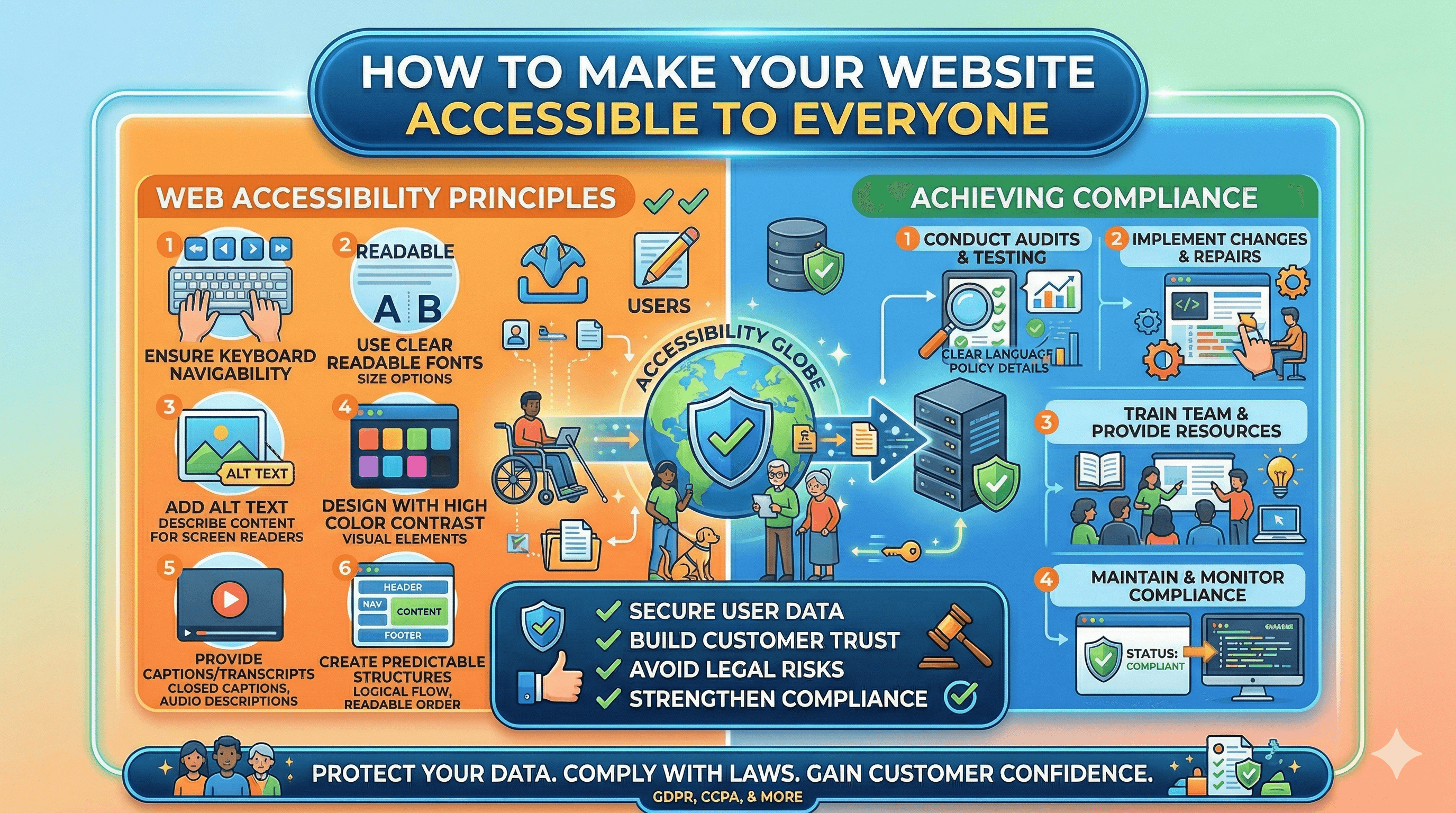
Web accessibility means making your website usable by everyone, including people with disabilities. That includes people who are blind or have low vision, people who are deaf or hard of hearing, people with motor disabilities who cannot use a mouse, people with cognitive disabilities, and people with temporary impairments like a broken arm or situational limitations like bright sunlight on a screen. Roughly one in four adults in the United States has some form of disability. That is a significant portion of your potential customers. Beyond the moral case for accessibility, there are strong business and legal reasons to make your website accessible. This guide gives you practical, actionable steps to improve your site's accessibility without requiring deep technical expertise.
Why Accessibility Matters for Your Business
The Business Case
Accessible websites serve more customers. If someone cannot navigate your site, read your content, or complete a purchase because of an accessibility barrier, you lose that sale. By removing barriers, you expand your potential customer base to include the millions of people who rely on assistive technologies to use the web.
Accessible websites also tend to be better websites overall. The practices that improve accessibility (clear headings, good contrast, descriptive links, fast loading times) also improve usability for all visitors, improve your SEO, and reduce bounce rates. Google rewards websites that provide good user experiences, and accessibility is a meaningful component of user experience.
The Legal Case
In the United States, website accessibility lawsuits have increased dramatically. Under the Americans with Disabilities Act (ADA), businesses that serve the public are generally expected to have accessible websites. The Department of Justice has clarified that the ADA applies to websites, and courts have consistently agreed. Thousands of businesses (including many small businesses) receive demand letters or lawsuits each year for inaccessible websites.
While the legal landscape varies by country, the trend globally is toward stronger accessibility requirements. The European Accessibility Act, Canada's Accessible Canada Act, and similar legislation in other countries all move in the same direction. Proactively making your website accessible reduces legal risk significantly.
The WCAG Standard
The Web Content Accessibility Guidelines (WCAG) are the internationally recognized standard for web accessibility. WCAG is organized around four principles, often abbreviated as POUR. Content must be Perceivable (users can see or hear it), Operable (users can navigate and interact with it), Understandable (users can comprehend the content and interface), and Robust (content works across different technologies and assistive devices).
WCAG has three conformance levels. Level A covers the most basic accessibility requirements. Level AA is the standard most laws and regulations reference, and it is the level most businesses should target. Level AAA is the highest standard and is often impractical for entire websites, though you can aim for AAA on specific pages.
Common Accessibility Issues
Before diving into fixes, it helps to understand the most common accessibility problems found on small business websites.
Missing alt text on images. Screen readers (used by blind and visually impaired people) cannot interpret images. Without alt text describing the image, the user gets no information about what the image shows.
Poor color contrast. Text that blends into its background is difficult or impossible to read for people with low vision or color blindness.
Missing or improper heading structure. Screen reader users navigate pages by jumping between headings. If your page skips heading levels (going from H1 to H4, for example) or uses bold text instead of proper heading tags, navigation becomes confusing.
Inaccessible forms. Form fields without labels, error messages that are not announced to screen readers, and forms that cannot be completed using a keyboard alone are common barriers.
No keyboard navigation. Some people cannot use a mouse and rely entirely on keyboard navigation (Tab, Enter, arrow keys). If interactive elements on your site are not reachable or usable via keyboard, those users are locked out.
Auto-playing media. Videos or audio that play automatically can be disorienting for screen reader users and distressing for people with certain cognitive disabilities.
Missing or unclear link text. Links that say "click here" or "read more" without context do not tell screen reader users where the link leads.
Practical Fixes You Can Implement Today
You do not need to hire an accessibility expert to make meaningful improvements. Here are concrete steps organized by effort level.
Alt Text for Images
Every meaningful image on your website needs descriptive alt text. This is the text a screen reader announces when it encounters an image. Good alt text describes what the image shows and why it matters in context.
Good alt text: "Team of three mechanics working on a car engine in our Portland repair shop." Bad alt text: "Image" or "photo1.jpg" or leaving the alt attribute empty.
For decorative images that do not convey meaningful content (background patterns, spacer images), use an empty alt attribute (alt="") so screen readers skip them entirely.
When building your website, make adding alt text to every image a standard part of your content workflow. Most content management systems have a dedicated field for alt text when you upload images.
Heading Structure
Use heading tags (H1, H2, H3, etc.) to create a logical content hierarchy. Your page should have one H1 (the main page title). Major sections use H2. Subsections within those use H3. Sub-subsections use H4. Never skip levels (do not jump from H2 to H4).
Do not use heading tags just to make text look big or bold. If you need larger or bolder text for visual purposes, use CSS styling instead. Heading tags carry semantic meaning that assistive technologies rely on for navigation.
A well-structured heading hierarchy also improves your SEO, as search engines use headings to understand your content structure and topic organization.
Color Contrast
WCAG AA requires a contrast ratio of at least 4.5:1 for normal text and 3:1 for large text (18px or larger, or 14px bold). Use a contrast checking tool like the WebAIM Contrast Checker (webaim.org/resources/contrastchecker) to verify your color combinations meet these requirements.
Common problem areas include light gray text on white backgrounds, colored text on colored backgrounds, and text overlaid on photographs. If your brand colors do not provide sufficient contrast for body text, use them for accents and larger elements while keeping body text in a high-contrast color (dark text on a light background, or light text on a dark background).
Do not rely on color alone to convey information. If you use red to indicate errors, also include an icon or text label. If a chart uses color-coded data, also include patterns or labels. This ensures people with color blindness can access the same information.
Keyboard Navigation
All interactive elements on your site (links, buttons, form fields, menus, tabs, carousels) must be reachable and usable with a keyboard alone. Test this yourself: put your mouse aside and try to navigate your entire website using only Tab (to move between elements), Shift+Tab (to move backward), Enter (to activate links and buttons), and arrow keys (to navigate within menus and other complex components).
Focus indicators. When you Tab to an element, a visible outline or highlight should show which element is currently focused. Many websites disable the default browser focus outline for aesthetic reasons, which makes keyboard navigation impossible. If you customize the focus indicator, make sure the replacement is clearly visible.
Tab order. The order in which Tab moves through elements should follow the logical reading order of the page (left to right, top to bottom for English-language sites). If your tab order jumps around unpredictably, check your HTML structure and any CSS or JavaScript that might be overriding the natural order.
Skip navigation. Add a "Skip to main content" link at the top of each page. This lets keyboard users bypass the navigation menu and jump directly to the page content. Without it, they must Tab through every menu item on every page visit.
Accessible Forms
Forms are critical interaction points, and adding a contact form to your website is one of the first things most small businesses do. Make sure your forms are accessible.
Label every field. Every form input needs an associated <label> element. The label should clearly describe what the field expects. "Email Address" is clear. A placeholder that disappears when you start typing is not an accessible substitute for a label because screen readers may not announce it, and the hint disappears once the user starts typing.
Group related fields. Use <fieldset> and <legend> elements to group related form fields (like a set of radio buttons or a billing address section). This provides context to screen reader users.
Error handling. When a form submission fails validation, clearly identify which fields have errors and describe what needs to be fixed. Error messages should be programmatically associated with their fields (using aria-describedby or similar techniques) so screen readers announce them. Do not rely solely on color (red border) to indicate errors.
Accessible CAPTCHAs. Traditional image-based CAPTCHAs are inaccessible to screen reader users. Use Google reCAPTCHA v3 (which requires no user interaction) or hCaptcha's accessible alternative.
Accessible Video and Audio Content
Captions. All video content should have accurate captions (not auto-generated, which are often inaccurate). Captions help deaf and hard-of-hearing users, but they also benefit people watching in noisy environments or with the sound off.
Transcripts. Provide text transcripts for audio content (podcasts, audio guides). Transcripts also benefit SEO by making your audio content searchable.
Audio descriptions. For videos where important visual information is not described in the dialogue or narration, provide audio descriptions. This is a secondary audio track that describes what is happening visually.
No autoplay. Do not auto-play video or audio. Let users choose when to play media. If you must auto-play, provide a clearly visible and keyboard-accessible pause or stop button.
Descriptive Link Text
Screen reader users often navigate by pulling up a list of all links on a page. Links that say "click here," "read more," or "learn more" are meaningless out of context. Instead, use descriptive link text that explains where the link leads.
Poor: "To learn about website speed optimization, click here." Better: "Read our guide on how to improve your website's loading speed."
The link text itself should make sense even if you cannot see the surrounding sentence.
Testing Your Website's Accessibility
After making improvements, test your site to identify remaining issues and verify your fixes work.
Automated Testing Tools
WAVE (wave.webaim.org) is a free browser extension that highlights accessibility issues directly on your page. It identifies missing alt text, contrast problems, heading structure issues, and more.
axe DevTools is a browser extension by Deque that provides detailed accessibility analysis. It is used by professional developers and accessibility consultants.
Lighthouse (built into Chrome DevTools) includes an accessibility audit that scores your pages and provides specific recommendations.
Automated tools catch approximately 30 to 50% of accessibility issues. They are a great starting point but cannot catch everything.
Manual Testing
Keyboard testing. Navigate your entire site using only a keyboard, as described above.
Screen reader testing. Try using a screen reader to navigate your site. NVDA (free, Windows) and VoiceOver (built into Mac and iOS) are good options. Even spending 30 minutes navigating your own site with a screen reader reveals issues that automated tools miss.
Zoom testing. Zoom your browser to 200% and verify that all content remains readable and usable. People with low vision often use browser zoom, and content that breaks or overlaps at higher zoom levels is a common problem.
Reading level. Use the Hemingway App or similar tools to check the reading level of your content. Aim for a Grade 8 reading level or lower. Clear, simple writing is more accessible to people with cognitive disabilities, non-native English speakers, and everyone else too. The principles of writing clear website copy align closely with accessibility best practices.
Prioritize Issues
You do not need to fix everything at once. Prioritize issues that affect the most users and create the biggest barriers. Missing alt text, keyboard navigation problems, and form accessibility issues typically have the highest impact. Color contrast issues are important but often easier to fix. Work through your issue list systematically, starting with the highest-priority items.
Building Accessibility Into Your Workflow
The most effective approach to accessibility is building it into your regular processes rather than treating it as a separate project.
When creating content: Always add alt text to images, use proper heading structure, write descriptive link text, and check your color contrast.
When adding features: Test keyboard navigation and screen reader compatibility before launching new features, forms, or interactive elements.
When choosing tools and plugins: Verify that third-party tools, plugins, widgets, and embedded content are accessible. Chat widgets, booking systems, and social media embeds are common sources of accessibility barriers. If your site runs on WordPress, our guide on making WordPress ADA accessible without overlays covers the right way to approach compliance on that platform.
When redesigning: Include accessibility requirements in your design brief. Choose accessible templates and themes. Test with real users with disabilities if possible.
Moving Forward
Web accessibility is an ongoing practice, not a one-time project. Start with the practical fixes outlined in this guide, focusing on the issues that affect the most users. Use automated and manual testing to identify remaining problems, and work through them systematically. Build accessibility into your regular content and development workflows so your site stays accessible as it evolves. The result is a website that serves all potential customers, reduces legal risk, improves SEO, and provides a better experience for everyone who visits.