Landing Page Optimization for Small Businesses
Your landing page is doing one of two things right now: converting visitors into customers or watching them leave. For most small businesses, the answer is painfully close to the second option. Industry data shows that the average landing page converts at just 2.35%, while the top 25% of pages convert at 5.31% or higher. That gap between average and good represents real revenue you could be capturing. The good news is that landing page optimization does not require a massive budget, a dedicated marketing team, or years of testing experience. It requires understanding what makes people take action and then systematically applying those principles to your pages.
Why Landing Pages Matter More Than You Think
Small business owners often treat their homepage as their primary conversion tool. They send paid traffic, email subscribers, and social media followers all to the same generic page. This is one of the most expensive mistakes in digital marketing.
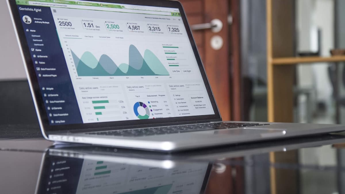
A dedicated landing page exists for a single purpose. Unlike your homepage, which serves multiple audiences and goals, a landing page strips away distractions and focuses the visitor on one specific action. Research from HubSpot found that businesses with 31 to 40 landing pages generated seven times more leads than those with only one to five.
Focused intent drives conversions. When someone clicks an ad about your plumbing services, they expect to land on a page about plumbing services, not your general homepage with links to HVAC, electrical, and remodeling. The closer the match between what the visitor expects and what they see, the higher the conversion rate. If you are not sure how a landing page differs from a regular website page, our explainer on what a landing page is vs. a website clarifies the distinction and when each is the right choice.
Landing pages enable precise tracking. With a dedicated page for each campaign, you can measure exactly which traffic sources produce results. You will know if your Facebook ads outperform your Google ads, or if your email campaign generates better leads than your organic search traffic. If you are running paid search campaigns, our guide to Google Ads for small businesses covers how to structure campaigns that pair well with dedicated landing pages.
Cost per acquisition drops significantly. By improving conversion rates from 2% to 4%, you effectively cut your customer acquisition cost in half without spending a single extra dollar on advertising. For small businesses operating on tight margins, this is transformative.
If you want to take a deeper look at turning your website into a lead generation engine, check out this complete guide to getting more leads from your website.
Crafting Headlines That Stop the Scroll
Your headline is the single most important element on your landing page. Research by Copyblogger suggests that 80% of visitors will read your headline, but only 20% will continue reading the rest of the page. You have roughly five seconds to convince someone they are in the right place.
Match your headline to the traffic source. If your Google ad says "Affordable Bookkeeping for Small Businesses," your landing page headline should echo that exact language. Message match builds immediate trust and tells the visitor they found what they were looking for.
Lead with the benefit, not the feature. "Save 10 Hours Per Week on Bookkeeping" is stronger than "Cloud-Based Bookkeeping Software." The first headline speaks to what the visitor actually wants. The second describes what you sell. People care about outcomes.
Use numbers when possible. Headlines with specific numbers outperform vague alternatives consistently. "Join 3,500 Small Business Owners" is more compelling than "Join Thousands of Small Business Owners" because specificity signals credibility.
Test question-based headlines. "Tired of Chasing Late Invoices?" immediately connects with a specific pain point. Question headlines work because they create an internal dialogue. The reader answers "yes" in their mind and keeps reading to find the solution.
Here is a formula that works well for small business landing pages: [Desired outcome] + [Time frame or ease] + [Without common objection]. For example: "Get More Clients This Month Without Spending More on Ads."
Designing Above-the-Fold Content That Converts
The "above the fold" area is everything visible on the screen before the visitor scrolls. This section must accomplish three things immediately: communicate what you offer, explain why it matters, and tell the visitor what to do next.
Keep your value proposition to one sentence. If you cannot explain your offering in a single, clear sentence, the message is too complicated. "We help local restaurants fill empty tables with targeted online marketing" tells the visitor exactly what you do and who you serve.
Place your primary CTA above the fold. The visitor should never have to scroll to find the main action you want them to take. Whether it is a button, a form, or a phone number, it must be visible immediately. Learn more about creating calls to action that actually convert with proven formulas and placement strategies.
Use a hero image that reinforces your message. Stock photos of smiling businesspeople shaking hands do not convert. Show your actual product, your real team, or an image that directly illustrates the outcome you are promising. Authentic imagery outperforms generic stock photos by a wide margin in conversion studies.
Remove the navigation menu. This is counterintuitive for many business owners, but landing pages perform better without a full navigation bar. Every link that is not your CTA is a potential exit. Some businesses see conversion increases of 20% to 30% simply by removing navigation from their landing pages. If you are evaluating tools for building high-converting pages, our best landing page builders for small businesses review compares the top platforms on ease of use, templates, and pricing.
Writing Body Copy That Addresses Objections
After your headline and above-the-fold content hook the visitor, your body copy must build the case for taking action. The most effective approach is to identify and systematically address every objection your potential customer might have.
Start with the problem, then present your solution. People are more motivated to avoid pain than to gain pleasure. Describe the frustrating situation your customer is currently in. Make them feel understood. Then position your product or service as the bridge to a better outcome.
Use the "so what?" test on every sentence. Read each line of your copy and ask "so what?" If you cannot clearly articulate why the reader should care about a particular statement, cut it or rewrite it. Every sentence must earn its place on the page.
Break up long paragraphs. Online readers scan before they read. Walls of text are intimidating and cause visitors to bounce. Keep paragraphs to three to four sentences maximum. Use bullet points for lists of features or benefits. Bold key phrases so scanners can grasp your message quickly.
Address pricing concerns directly. If you are more expensive than competitors, explain why. If you offer payment plans, mention them. If you have a money-back guarantee, make it prominent. Leaving pricing ambiguous does not prevent objections. It just prevents conversions.
Include specific results and data. "Our clients see results" is weak. "Our clients see an average 34% increase in website leads within 90 days" is specific and believable. Whenever possible, quantify the benefits you deliver. If you want to strengthen your overall website copy, this guide on writing website copy that converts covers the fundamentals.
Optimizing Forms for Maximum Completion
Forms are where landing page conversions live or die. Every additional field you add to a form increases the likelihood that a visitor will abandon it. Research consistently shows that reducing form fields increases conversion rates, sometimes dramatically.
Ask only for what you absolutely need. For a top-of-funnel lead magnet, you probably only need a name and email address. For a quote request, you might need a few more details. But question whether you truly need a phone number, company size, job title, and budget range all at the initial contact stage.
Use smart defaults and auto-fill. Enable browser auto-fill on your forms so returning visitors or those with saved information can complete your form with minimal effort. Reducing friction at every step matters.
Place labels above input fields, not beside them. Eye-tracking studies show that top-aligned labels are processed faster than left-aligned labels. This small design choice reduces the cognitive load of completing your form.
Use multi-step forms for complex requests. If you genuinely need a lot of information, break the form into steps with a progress indicator. A five-step form with two fields per step feels less overwhelming than a single form with ten fields. People who complete the first step are psychologically committed and more likely to finish.
Add micro-copy beneath sensitive fields. Next to the email field, add "We will never share your email." Next to the phone field, add "Only used to schedule your free consultation." These small reassurances reduce anxiety and increase completion rates.
Leveraging Social Proof Effectively
Social proof is one of the most powerful psychological triggers in marketing. When visitors see that other people (especially people like them) have taken action and had positive results, their resistance drops significantly.
Feature testimonials with specific outcomes. "Great service!" is a useless testimonial. "JustAddContent helped us increase our website traffic by 47% in three months" is compelling because it includes a measurable result. Always ask customers for specific, quantifiable feedback.
Display logos of recognizable clients or partners. If you have worked with any well-known businesses, even at a small scale, display their logos. This borrowed credibility signals trustworthiness to new visitors.
Show real numbers. "Trusted by 2,300 businesses" or "Over 10,000 projects completed" provides concrete social proof. If your numbers are modest, focus on a metric that sounds impressive. Even "97% client retention rate" works if your raw customer count is still growing.
Add review scores from third-party platforms. Google reviews, Yelp ratings, or industry-specific review sites carry more weight than testimonials on your own website because visitors know you cannot fabricate them. Embed or screenshot these reviews to add authenticity.
Use case studies strategically. A brief one-paragraph case study with a before-and-after metric can be extremely persuasive. "Local bakery went from 12 to 45 online orders per week within 60 days of launching their optimized landing page" tells a story that visitors can imagine applying to their own business.
Mobile Optimization Is Not Optional
More than 60% of web traffic now comes from mobile devices, and for many local businesses, that number is even higher. If your landing page is not fully optimized for mobile users, you are losing the majority of your potential conversions.
Design for thumbs, not mice. Buttons should be at least 44 pixels tall and wide. Form fields need adequate spacing between them. Links that are too close together cause accidental taps and frustration. Test your page by navigating it with just your thumb.
Prioritize load speed on cellular connections. Mobile users are often on slower connections than desktop users. Compress all images, minimize code, and eliminate anything that is not essential to the conversion. A one-second delay in mobile page load time can reduce conversions by up to 20%.
Simplify layouts for smaller screens. Multi-column layouts should stack to a single column on mobile. Side-by-side testimonials should become a scrollable carousel. Your landing page might look great on a 27-inch monitor and be completely unusable on a 6-inch phone screen.
Make phone numbers tap-to-call. For service businesses, a significant portion of mobile conversions happen via phone calls. Make sure your phone number is a clickable link that opens the dialer. Place it prominently near the top of the mobile version.
Test on actual devices. Browser developer tools can simulate mobile screens, but they do not perfectly replicate the real experience. Test your landing page on at least two or three actual phones with different screen sizes to catch issues that simulators miss.
Page Speed and Technical Performance
A landing page that loads slowly will never convert well, regardless of how good the copy and design are. Google data shows that as page load time increases from one to three seconds, the probability of bounce increases by 32%. From one to five seconds, it jumps by 90%.
Compress images aggressively. Images are typically the largest files on a landing page. Use WebP format when possible, and make sure no image is larger than it needs to be for its display size. A hero image displayed at 800 pixels wide does not need to be uploaded at 3000 pixels wide.
Minimize third-party scripts. Every analytics tool, chat widget, social media pixel, and tracking script adds to your page load time. Audit your scripts regularly and remove anything that is not actively delivering value.
Use a content delivery network (CDN). A CDN serves your page from the server closest to the visitor, reducing load times for people who are geographically distant from your hosting server. Most modern hosting platforms include CDN capabilities.
Enable browser caching. Returning visitors should not have to download the same resources again. Configure your caching headers so that static resources like images, CSS, and JavaScript are stored locally in the visitor's browser.
Test your speed regularly. Use Google PageSpeed Insights, GTmetrix, or WebPageTest to monitor your landing page performance. Make speed optimization a recurring task, not a one-time effort.
Color, Contrast, and Visual Hierarchy
The visual design of your landing page guides the visitor's eye toward the most important elements. Poor visual hierarchy means visitors do not know where to look, what matters, or what to do next.
Create contrast for your CTA button. Your primary call-to-action button should be the most visually prominent element on the page. Use a color that contrasts with the rest of your design. If your page is primarily blue, an orange or green button will stand out. The button should look like a button, with clear boundaries, a distinct color, and readable text.
Use whitespace generously. Whitespace (empty space around elements) is not wasted space. It reduces visual clutter, makes content easier to read, and draws attention to the elements you want visitors to focus on. Crowded pages feel chaotic and untrustworthy.
Establish a clear visual path. The visitor's eye should follow a logical path from headline to supporting copy to social proof to CTA. Use layout, size, color, and spacing to create this flow. If you are not sure where visitors are looking, heatmap tools can reveal exactly what draws attention and what gets ignored.
Limit your color palette. Stick to two or three primary colors plus neutral tones. Too many colors create visual noise and make the page feel unprofessional. Your brand colors should dominate, with one accent color reserved for CTAs and important highlights.
Choose readable fonts and sizes. Body text should be at least 16 pixels on desktop and scale appropriately on mobile. Avoid decorative fonts for body copy. Headings can be more expressive, but body text must prioritize legibility above all else.
Trust Signals and Risk Reversals
Every visitor who arrives at your landing page carries a degree of skepticism. They want to know if your business is legitimate, if your offer is real, and if they will regret taking action. Trust signals and risk reversals address these concerns directly.
Display security badges and certifications. SSL certificates, industry certifications, Better Business Bureau ratings, and payment security logos all reduce perceived risk. Place them near your form or CTA where the visitor is making their decision.
Offer a clear guarantee. "30-Day Money-Back Guarantee" or "100% Satisfaction Guaranteed" removes the fear of making a bad decision. The stronger your guarantee, the lower the perceived risk. And in practice, very few customers actually use guarantees, so the cost to your business is minimal.
Include a privacy statement near forms. A brief note like "Your information is secure and will never be sold to third parties" addresses a genuine concern that prevents many visitors from submitting their details.
Show your physical address and phone number. For local businesses especially, displaying a real address and phone number signals legitimacy. Visitors want to know there is a real business behind the website, not a faceless entity.
Feature team photos and bios. Putting real faces on your business builds trust. A photo of your team, your office, or yourself working with a client humanizes your brand and makes visitors more comfortable taking the next step.
Measuring and Iterating on Results
Optimization is not a one-time event. It is an ongoing process of measuring results, forming hypotheses, testing changes, and implementing winners. The businesses that achieve the highest conversion rates are the ones that commit to continuous improvement.
Set up proper conversion tracking. Before you change anything, make sure you are accurately tracking conversions. Whether you use Google Analytics goals, Facebook pixel events, or a CRM integration, you need reliable baseline data. Without it, you cannot measure improvement.
Track micro-conversions too. Not every visitor is ready to buy or submit a form. Track secondary actions like video views, PDF downloads, scroll depth, and time on page. These help you understand engagement and identify where people drop off.
Change one element at a time. If you change your headline, button color, and form layout simultaneously, you will not know which change affected your conversion rate. Isolate variables so you can attribute results to specific changes.
Run tests long enough for reliable results. A test that runs for two days with 50 visitors per variation tells you nothing reliable. Low-traffic sites may need to focus on larger, more impactful changes rather than subtle tweaks.
Document everything. Keep a log of every test you run, including the hypothesis, the change, and the result. Over time, this log reveals patterns about what your audience responds to.
Common Landing Page Mistakes to Avoid
Even well-intentioned optimization efforts can backfire if you fall into these common traps. Knowing what to avoid is just as important as knowing what to do.
Too many calls to action. When you ask visitors to call, email, fill out a form, follow you on social media, and read your blog all on the same page, they typically do none of those things. Choose one primary CTA and remove everything that competes with it.
Slow-loading video backgrounds. Video backgrounds might look impressive, but they dramatically increase load times. If you must use video, ensure it is heavily compressed and does not autoplay with sound. A fast-loading page with a static image will almost always outperform a slow page with a video background.
Ignoring the thank-you page. After a visitor converts, the thank-you page is your opportunity to set expectations, offer a secondary action, or reinforce their decision. A blank "thanks for submitting" page is a missed opportunity. Use this page to tell them what happens next, offer a relevant resource, or invite them to follow you on social media.
Writing for yourself instead of your customer. Your landing page should not be a catalog of your company's accomplishments. It should be a mirror that reflects your customer's problems and desires back at them. Frame every message in terms of what the visitor gains, not what you have done.
Forgetting about accessibility. Visitors with visual impairments, motor disabilities, or cognitive differences deserve an optimized experience too. Ensure sufficient color contrast, add alt text to images, make forms keyboard-navigable, and test with screen readers. Accessible design often improves usability for all visitors.
Putting It All Together
Landing page optimization is not about implementing one magic trick. It is about systematically improving every element of your page so that together, they create a seamless path from visitor to customer. Start with the fundamentals: a clear headline, a focused offer, a single CTA, and fast load times. Then layer on social proof, address objections, and optimize your form.
The most important thing is to start. Pick the lowest-hanging fruit first. If your page takes six seconds to load, fix that before you worry about button colors. If you have no social proof on the page, add some before you start testing headline variations. Prioritize the changes most likely to move the needle.
Small businesses have a real advantage in this process. You are closer to your customers than any large corporation will ever be. You understand their pain points, their language, and their decision-making process intimately. Use that knowledge to create landing pages that speak directly to the people you serve, and the conversions will follow.